|
.RLC Files
|
|
| EbelAngel | Date: Thursday, 25/July/2013, 3:13 AM | Message # 21 |
 Site Administrator
Group: Administrators
Messages: 996
Status: Offline
| AAAhhhhh


|
| |
|
|
| ab_99 | Date: Thursday, 25/July/2013, 8:12 AM | Message # 22 |
|
Count
Group: Modders
Messages: 126
Status: Offline
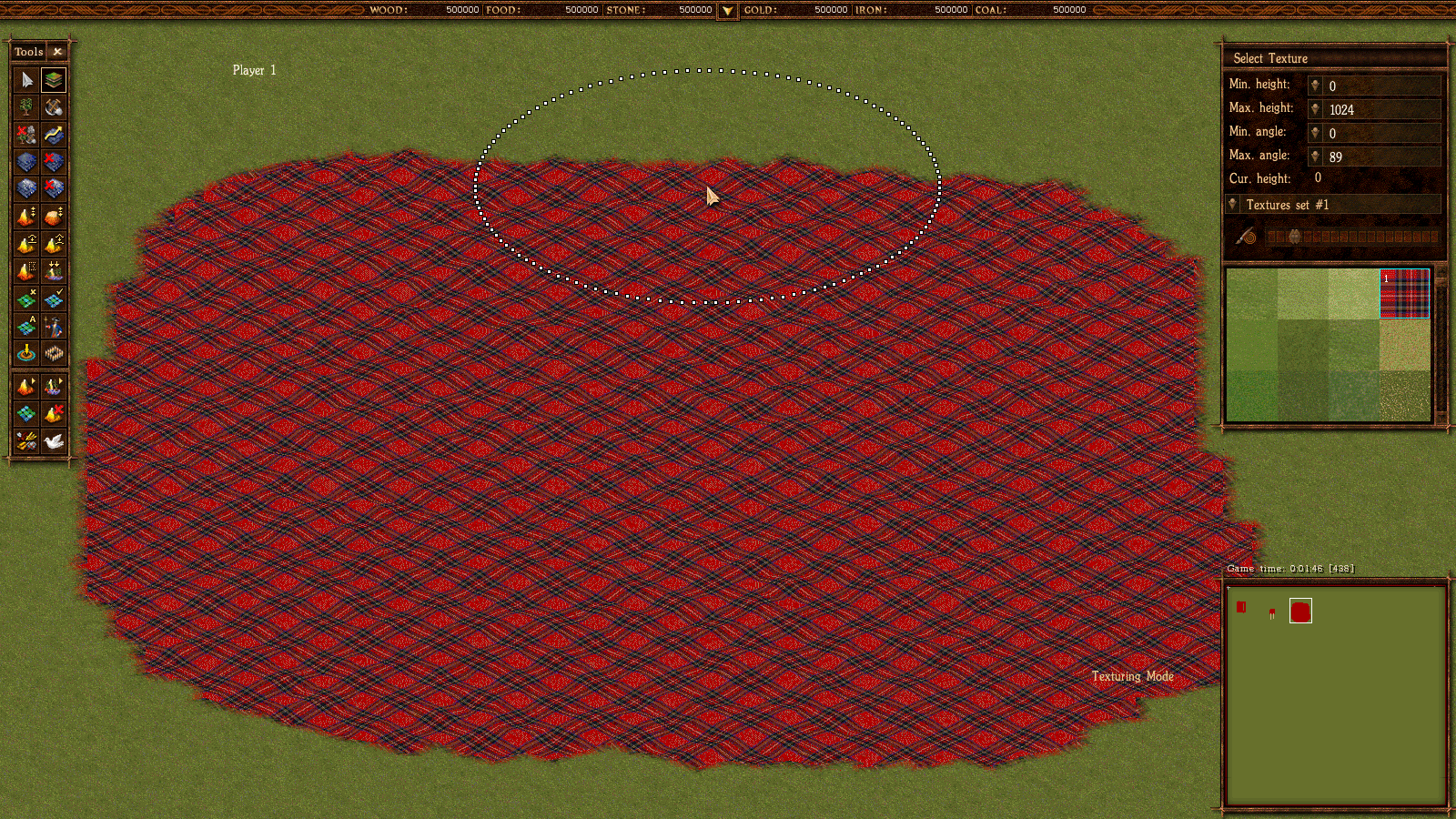
| very beautiful fabric. 
according to this law, all textures are distorted. The idea is we need to see fabric on a flat table.
The lines should be straight. because the surface is flat with no relief.
|
| |
|
|
| EbelAngel | Date: Thursday, 25/July/2013, 2:14 PM | Message # 23 |
 Site Administrator
Group: Administrators
Messages: 996
Status: Offline
| Yes i noticed it too. Not only distorted ( or is that a trick of the mind and the eyes?) but also placed diagonallly.

|
| |
|
|
| ab_99 | Date: Thursday, 25/July/2013, 7:46 PM | Message # 24 |
|
Count
Group: Modders
Messages: 126
Status: Offline
| This is normal, isometrics - rotate by 45 degrees, and the vertical compression twice. Additionally interferes with a surface defect.
If we take a monochromatic texture such as yellow, we see the band on the map brightness. It also distorts the texture, even if we made it seampless (no tiling).Added (25/July/2013, 7:46 PM)
---------------------------------------------
That's what I meant. The top texture - monophonic fill. On the map are streaks and spots. And the bottom texture - white color, but the results are so different.

|
| |
|
|
| EbelAngel | Date: Friday, 26/July/2013, 1:29 AM | Message # 25 |
 Site Administrator
Group: Administrators
Messages: 996
Status: Offline
| Ow yes I see, that doesnt look very good indeed. How do you get that? Are those textures you added yourself? I just tried that file i posted here above in AC, but none of the textures look that bad.

|
| |
|
|
| ab_99 | Date: Friday, 26/July/2013, 8:24 AM | Message # 26 |
|
Count
Group: Modders
Messages: 126
Status: Offline
| I filled the top texture color to show spots of brightness.
Lower - native 110 texture Conquest. Perhaps 110 texture has original options.
PS! checked.
effectively connected with parameters. 109 and 110 are identical texture. all plain textures have color spots and stripes.

Message edited by ab_99 - Friday, 26/July/2013, 8:38 AM |
| |
|
|
| EbelAngel | Date: Friday, 26/July/2013, 2:46 PM | Message # 27 |
 Site Administrator
Group: Administrators
Messages: 996
Status: Offline
| Give me your tiles3.bmp for AC with the textures from above please. I want to try this. I can't seem to reproduce your issue.

|
| |
|
|
| ab_99 | Date: Friday, 26/July/2013, 3:57 PM | Message # 28 |
|
Count
Group: Modders
Messages: 126
Status: Offline
| checked on the Russian and English versions of conquest.
PS! By the way, you can change the texture of the 110 "Cossacks 1".
the result is the same.
Message edited by ab_99 - Friday, 26/July/2013, 4:43 PM |
| |
|
|
| EbelAngel | Date: Friday, 26/July/2013, 4:44 PM | Message # 29 |
 Site Administrator
Group: Administrators
Messages: 996
Status: Offline
| Its not the texture, its the settings. When I use your tiles3.bmp i get the same result.
When i copy those textures into another position, it doesnt not happen, so its the settings.
Remember what i said about textures.lst, it can set specifics for textures. In this case 109 and 110 are listed as "#MULTI 110 109 110 108".
Its obviously trying to 'blend' 110 with 108' hence the weird result.
Either change that or do not overwrite textures that are used in textures.lst ( for buildings, roads etc).
Try this one and look for that texture you posted above ( its around 229 or so), you will see it doesnt behave so weird there:

|
| |
|
|
| ab_99 | Date: Friday, 26/July/2013, 5:30 PM | Message # 30 |
|
Count
Group: Modders
Messages: 126
Status: Offline
| maybe the reason in these lines:
#MULTI 110 109 110 108
|
| |
|
|