|
@Bzik
|
|
| Bzik | Date: Tuesday, 27/December/2011, 9:54 PM | Message # 21 |
|
Baron
Group: Checked
Messages: 43
Status: Offline
| Quote Or maybe their hat indeed, but remember how that looked on that picture on the previous page? And could the shaders be lost because I told you to set similarity to 4000 ( max) in palitra? Maybe with less it wouldnt kill so much off the shaders. I didnt think off this when i tried that other unit
Ok, I'll check it again. I looked on other bmp's and there is more cases like pike18, so its crucial to make it right.
Quote .lst file name should be the same as the folder name no? and the lst and the frames should be in the same folder aswell, right? Not sure what else you were doing?
When I converted and copied tga's to any other folder than directory \BMPtoTGAConvert\OutputDir and tried to open them in Gigapack the frames row didnt show any tga even I had proper lst file in selected folder. But when I copied those tga+lst to OutputDir folder, Gigapack properly shows all tga and conversion was sucessful. But dont worry about it. I would call it perversity of inanimate objects:)
BTW - I looked at C1 icons, on your screen they look little grainy, probably becuse of resizing screenshot. I made one - if you have same or better quality then OK, if not I can send you some samples.

|
| |
|
|
| EbelAngel | Date: Wednesday, 28/December/2011, 9:00 AM | Message # 22 |
 Site Administrator
Group: Administrators
Messages: 996
Status: Offline
| Quote (Bzik) I would call it perversity of inanimate objects:)
Lol.
Quote (Bzik) probably becuse of resizing screenshot.
I dont know, they were thumbnails displayed in folder explorer at medium size, so i dont think those are exactly the same size as in game. On top off that those screenshots were saved as low quality .jpg format.
So I started comparing icons.
First I noticed your bmp you posted above was 55x55 size. Thats a bit too large, it doesnt fit in the upgrade background. It overlaps the borders.
So I resized it and framed it.
First one is original Cossacks icon(41x41), second yours(55x55) ,third mine(46x46)
  
Then Resized to 46x46 and pasted in the 52x52 frame(-3x3border=46x46)
  
Then Ingame they appear inside the 56x56 background frame(not in editor select list or selpoint but in buildings to produce)
There is a small difference between yours and mine. Probably differently cut/resized. The original one has a different cut too(higher up).
Notice how in the produce part in a building the infinite produce icon overlaps 25% off the icon. In that aspect the original C1 icon is better cut.
I also noticed that the 52x52 frame I have been using since the beginning is actually a pixel off with the background frame(56x56). It should have been 54x54. Never noticed it untill now, been making that mistake right from the beginning.
So I have these large images in 140x140 format:
And I cut it into a 54x54 (and pasted it in the 56x56 background~so it looks like ingame, but without extra border*since only the produce in building has this backdrop, no border would appear in the selpoint (selectpoint or editor select point):

Ofcourse it looks better , problem is, I only have these large 140x140 images for the original C1's. If any flagbearers or units from mods are used I cant reproduce this.
And then I started questioning everything.
What if I resize the Data/Interf3/upgrade.g17 ( which is that 56x56 background frame that has those 2 little buttons on the right side to show the progress(green) build bar when making units) to fit the original C1 size icons(41x41)?
It would mean that I would have to resize any C2 icons I already made previously to a smaller size but it's better than making them larger again.(to fix that small 1 pixel offset frame i mistakenly used).
And should I make that infinite sign smaller so it doesnt overlap so much off the icon?
I'm pretty convinced that using smaller icons ( anywhere in the size range off 40 to 60 pixels ) is the way to go, because, quite frankly the large interface selection point with the BigIcons takes up so much space, we also can't reproduce it for C1 units - buildings because we don't have such huge images to make icons and above all, that old interface is terrible to use.
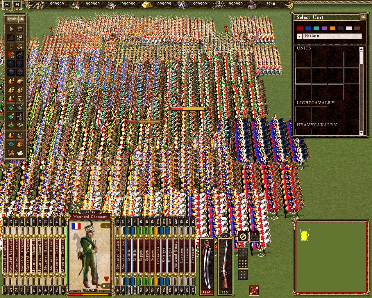
Just one more pic to make a point:
Its 'ok' if you select a few units but once you select your army it covers like 20 - 30% off the screen , especially if you play on a lower resolution(not everyone has a large screen). I can hide like 10 formations behind that interface and you wont see they are there.
On top off that I have to tilt my head just to read which unit I want to select. You also dont see the unit untill you select the tab.
Tell me what you think.

Message edited by EbelAngel - Wednesday, 28/December/2011, 9:53 AM |
| |
|
|
| Bzik | Date: Wednesday, 28/December/2011, 12:15 PM | Message # 23 |
|
Baron
Group: Checked
Messages: 43
Status: Offline
| Hi,
Thinking that original icon looks best. I dont have Imperia on HD now but I'm pretty sure that in editor they were some icons of flagbearers.
Quote And should I make that infinite sign smaller so it doesnt overlap so much off the icon?
Dont forget about other options of 10,20,30 etc units to produce, If those numbers will be well visible ingame, than its good option to make it a little smaller.
Other points:
- do you tried old C1 icons of defence/attack? Inspite of simplicity they are IMO more clear with black bacground than those from AC.
- on screenshot green HP level bar looks to much bright comparing to other objects.
Quote Tell me what you think.
Of corse they are too big, probably gsc paid a lot for this artwork, so they just want to show off:) Also this interface is hard to use, you need to click few times to choose right formation from bunch of others. An most painfull is when you accidentaly click two times chosing one particular formation and make order for move to all same formations in screen range. So its definitely thing to rework.
By the way - do you have some graphics for menus etc? In case of C1 17/18 mod version Napoleonic theme didnt match too much there. When I searched for graphs to C1 mod I came to great artworks, in this case they are with Winged Hussars motive, I can ask this guy if he allows us to use them somewere. Also there is a lot of other beautifull paintings, that can be used freely. I can look for them if youre interested.
Few words about pike problem - I'm afraid that we cant add shading in palitra. Decreasing similiarity just leaves more blue. One option is to change blue colour for some universal "real' national colour for all players and look for other body parts to switch their colour to pink. I will play with this case, in meantime converting other units.
Seeya!
Message edited by Bzik - Wednesday, 28/December/2011, 12:15 PM |
| |
|
|
| EbelAngel | Date: Wednesday, 28/December/2011, 1:53 PM | Message # 24 |
|
Site Administrator
Group: Administrators
Messages: 996
Status: Offline
| Quote (Bzik) Thinking that original icon looks best.
Allright, so I'll adjust the interface to fit the original C1 icons size and make the C2 icons I already did a bit smaller to fit that size.
Quote (Bzik) I dont have Imperia on HD now but I'm pretty sure that in editor they were some icons of flagbearers.
Yes , all those mods (Baddog, OC, Imperia) have icons for the respective new units they introduced.
Quote (Bzik) Dont forget about other options of 10,20,30 etc units to produce, If those numbers will be well visible ingame, than its good option to make it a little smaller.
I'll have a look into that.
Quote (Bzik) - do you tried old C1 icons of defence/attack? Inspite of simplicity they are IMO more clear with black bacground than those from AC.
No i havent tried them yet. I just used those because I found them in .G17 format in HoAE ( no idea what those were doing in there, typical gsc, i found HoAE units in BFE,...) I just quickly put it in there to test if those attack/defense icons would show up at all when I was setting up the functionality in the interface.
Quote (Bzik) - on screenshot green HP level bar looks to much bright comparing to other objects.
Agreed, so far I had just focussed a bit on functionality. There was no life bar for single units in the original Cossacks 2. When I add it its by default this green ( same as the produce line that goes up when creating units) but it can be changed.
Quote (Bzik) By the way - do you have some graphics for menus etc?
No I dont, so far I only used what was in game available.
Those posted images are some really fine art. Very nice to look at.
|
| |
|
|
| Bzik | Date: Thursday, 29/December/2011, 11:20 AM | Message # 25 |
|
Baron
Group: Checked
Messages: 43
Status: Offline
| Angel, I'm still bit confused with national colour thing. I started to convert units, but still not sure about final effect... In C2 units have only little part of sleeve as national colour, so rest of clothes are well modelled. C1 units are opposite. There are only 1 or 2 colours that we can use for this purpose and most of the time each colour covers at least 1/3 of unit, so shade/noshade areas are quite visible. If we have some feathers on helmet etc maybe its worth to try to set it as national colour, but its only few units... It didnt look very bad, but if you take closer look... hmm.
Please, check .rar pack with two ready units and try them ingame. What do you think? Honestly, I have dillema with leaving it that way...
LinkAdded (29/December/2011, 11:20 AM)
---------------------------------------------
OK, I think I got it! Looks like the solution was the easiest one - we need to properly switch every of tones, so basic blue for basic pink and then light blue for light pink etc, in first experiment in editor national colour shows shades.
|
| |
|
|
| EbelAngel | Date: Thursday, 29/December/2011, 2:50 PM | Message # 26 |
|
Site Administrator
Group: Administrators
Messages: 996
Status: Offline
| Quote (Bzik) OK, I think I got it! Looks like the solution was the easiest one - we need to properly switch every of tones, so basic blue for basic pink and then light blue for light pink etc, in first experiment in editor national colour shows shades.
Oh, glad you figured it out! Seems logical if you say it now. I thought about it but stopped thinking about it because I thought gigapack could only read 1 national colour and not different variations on the national colour.
I was thinking about playing a bit with the ingame national colours, because those colours are a bit bright. I was trying to get it darker so you wouldnt notice the lack off shading so much, but well since you figured it out it doesnt really matter anymore I suppose.
Then again, those colours are kinda bright aren't they. It's just if you change to a darker colour ingame, you may not notice those shadings you just fixed so good anymore.
I used red and turned it into blue so you would see it next to the original blue ( line 2) then green in row 4, original green in row3.
While we are at national colours, might as well think about the ingame national colour.
What's your opinion on this. Keep it as it is? Use less bright colours? Use different colours?
|
| |
|
|
| Bzik | Date: Thursday, 29/December/2011, 6:39 PM | Message # 27 |
|
Baron
Group: Checked
Messages: 43
Status: Offline
| Hi,
I added this unit pack before update, so those units are without shading. You can remove this pack from server.
Im starting to like modding - when you solve one problem almost imediately another shows of:) look at it:
Link
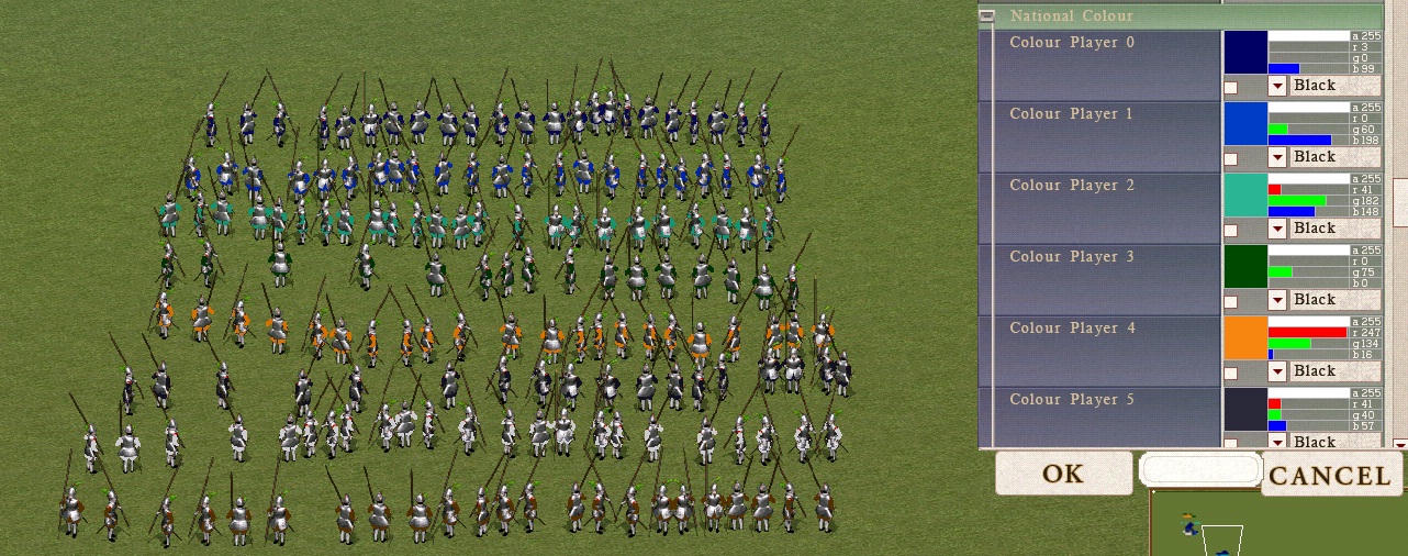
Paste this photo into Corel and compare with pipette colours from row with those on units.
I used basic colour for experiment. Dont know why but we can achieve only two shades of basic colour: in my example green and red. Why palitra didnt see blue R0 G36 B148? Tried to switch sequence in second row, change only 3 colors etc but without effect.
At this moment even with 2 shades of pink units looks quite good IMO, but I dont know how they look in best quality in game (I choose medium quality while installing game). So it will be best if we can get full switch of 4 colours just in incase. Maybe you can figure out what I cant see?
PS. Its not bad idea to tweak ingame colours. This original C1 screaming bright green is made for some colour pervs probably:) I think about them also.
Message edited by Bzik - Thursday, 29/December/2011, 6:47 PM |
| |
|
|
| EbelAngel | Date: Thursday, 29/December/2011, 7:31 PM | Message # 28 |
|
Site Administrator
Group: Administrators
Messages: 996
Status: Offline
| Quote (Bzik) Im starting to like modding - when you solve one problem almost imediately another shows of:) look at it:
Lol yes indeed, you change one thing and the next issue comes along. Got the same with the icons now, by using 40x40 size icons I have to reset like at least 15 interface files that all have icons in them.
Im not sure about why. Maybe the colour ranges are too close? What happens if you play with similarity settings? Like instead off 4000 to 2000 or 3000? And is this even related to colour tones. Because a russian translator tells me it means 'similarity' but that doesnt really mean anything to me. Im not sure about its function, i just noticed if set to 0 its bad.
I also noticed there are more than 4 types off blue. I remember writing down 8 in total on that first BaddogEngPike. And on this one (polish pike .png) I noticed there's a small section off 0 70 223.
From BaddogPike the other 4 colours were:
R 11 G 27 B 111
R 14 G 44 B 110
R 16 G 45 B 144
R 20 G 40 B 96
But, if you find it 'good' with 2 shaders ingame, then I wouldnt worry too much, however if you want to check on "high" quality settings, despite having installed the game at "medium" quality, you can change it ingame. In editor, press control +E -> gamesettings, S&V options ( sound and video) or in one off those options, it should have quality settings, probably numerical value 0,1, 2 if I recall correct. If its not like this, I will look it up.
And isnt this in the regular game options, where you can adjust sound volume? Cant remember now exactly but I think it was either there or I added it in the interface. I will look up if you cant figure it out.
Next thing, remember you were asking about upgrade icon levels and I said they need to be on the icons itself, so what do you prefer, a darkgold set or a redgold set? And sizewise, smaller, large? Position lower right good or prefer top left?
^^ I need to cut the red one's better , there's some white-ish around them, but if you dont like the red one's, I wont bother spending more time on them.
Btw, I always forget to ask but what computer system do you have? OS (xp?) CPU, RAM, VideoCard(Ram), Native ScreenSize?
Message edited by EbelAngel - Thursday, 29/December/2011, 7:38 PM |
| |
|
|
| Bzik | Date: Thursday, 29/December/2011, 8:31 PM | Message # 29 |
|
Baron
Group: Checked
Messages: 43
Status: Offline
| Here are sample of pike with shaders:
Link
If youre interested these are RGB values I choose:
255,0,255
125,0,125
55,0,55
105,0,105
Quote What happens if you play with similarity settings? Like instead off 4000 to 2000 or 3000?
I'll check it tommorow, as I remember with first trials (all 4 pink same rgb) lower similiarity leaves more old blue untouched.
Quote And isnt this in the regular game options, where you can adjust sound volume?
Its possible in BFE. In my version of NW I had to decide about qulity just after installing.
Gold icons definitely, lower corner looks OK.
Good night!
|
| |
|
|
| EbelAngel | Date: Friday, 30/December/2011, 9:28 AM | Message # 30 |
|
Site Administrator
Group: Administrators
Messages: 996
Status: Offline
| Quote (Bzik) If youre interested these are RGB values I choose:
Yes! write down as much detail as you can, because after a while you will start forgetting details. There's just too much small things too remember. Just in case something needs to be redone,...
Quote (Bzik) Gold icons definitely, lower corner looks OK.
Gold Icons it is then. How many levels should I make? 3? 4? ( 0, I, II, III)?
I checked out your PolPike17.
I think it looks rather well now. I'd like to see anyone else try this 
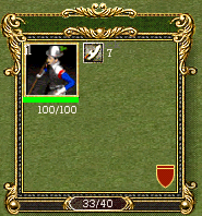
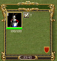
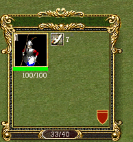
So here are some small screenies off 40x40 icons in game, same size as the original C1 icons.
Then a few of some off the changes in the interface.
^^ So I'v changed that infinite sign, deleted that green button and bar and put the sign directly on the icon.
That bright green line that goes up when creating units is moved and changed into a "coloured bar" that moves from bottom to top over the icon. It's still a bit too greenish I think. I want it to be near transparent gray-ish so you still see the icon behind it but also see the progress off the buildstage.
Still got a lot off work on this one. Like the number off units appearing on it is not well aligned, maybe I should make it a bit smaller so it fits better in the top right corner. Never mind the 56x56 weapons icons and those 3 on the right ( ability buttons), havent changed those yet.
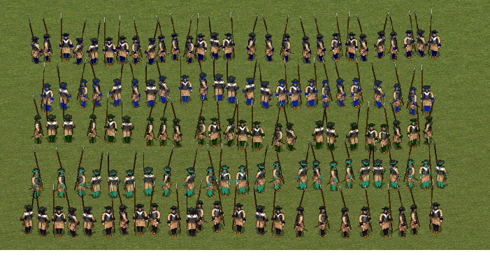
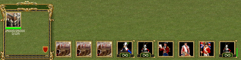
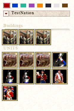
It groups generals in the first row, then artillery in the second row, formations in the third row and single units in the 4th row.
I'm also thinking about which frame to put around it, because now it's just a bunch off icons grouped.
I cant finalize the interface entirely yet untill I also have the smaller icons for defense, attack and the medium sized one's for formations, weapons, abilities.
Also, do you think it would be good to have some kind off "life line" on the icons in the multi selection point?
Step by step ...
Tell me your thoughts, remarks,...
E.A.
Message edited by EbelAngel - Friday, 30/December/2011, 9:36 AM |
| |
|
|