|
@Bzik
|
|
| Bzik | Date: Friday, 30/December/2011, 6:40 PM | Message # 31 |
|
Baron
Group: Checked
Messages: 43
Status: Offline
| Hello,
Palitra works well, similiarity level was the key, we got all shades present in C1. Ill write later my insights, today or tommorow I will send you final ver of converted pikeman, hope you will aprove it 
There were only problems with "polish pike" kind of units with a lot of national colour on them. It took some time to crack it, other conversions should go easily now.
C2 building icons are superb, do you need help in creating C1? There is no turn back now, we need to make them equally good.
UPGRADE numbers (one thing - I see only screens so my opinion may be skewed with this fact, and in game it may looks properly) are not well visible. Compare those from earlier post (SetIconsLevel). In graph there is little black spot on background so gold numbers stands out from picture. In pic with peasant and axe numbers loose somewhere between colours. Maybe check old simple icons of C1 with black background and one centered graph related to upgrade? Maybe compare them?
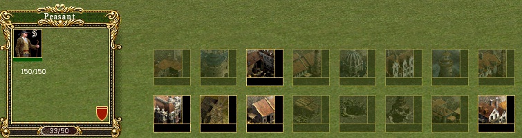
PEASANT MENU - can you group icons more tight? Just for note - its a secondary matter but I make also little change in C1 building menu. At top row economic/village buildings, in center row city buildings and in last third row military and defensive buildings. It was "intuitive" selection, I was always wondered why buildings in menus of C series arent grouped in some way, its easy to do.
Quote That bright green line that goes up when creating units is moved and changed into a "coloured bar"
To make proper judgment I have to see it working. Its static screen, so you need to rely on your aesthetic sense:)
If it looks good leave it. IMO bar isnt such important. If you make 100 units, you didnt (at least I) look how fast particular unit is created. Its more important if something takes lot of time (eg. Academy). About numbers - do you tried good old C1 style, when number of units was in top left corner? C2 icons are different but In case of C1 icons there is black background in top left so its fit there nice.
Quote Also, do you think it would be good to have some kind off "life line" on the icons in the multi selection point?
Grouping of units is very good idea. "Life line" - depends how it will looks. If it takes too much space or will be distracting, there is no purpose to keep it there IMO.
|
| |
|
|
| EbelAngel | Date: Friday, 30/December/2011, 7:16 PM | Message # 32 |
 Site Administrator
Group: Administrators
Messages: 996
Status: Offline
| Quote (Bzik) Palitra works well, similiarity level was the key, we got all shades present in C1
Good, nice to see you figured it out then.
Quote (Bzik) C2 building icons are superb, do you need help in creating C1? There is no turn back now, we need to make them equally good.
See attachment.
I'm not happy about the current C1 buildings I have in there now, but at least we got something visual so we see what we click on when we add unit/buildings rather than hoovering over empty buttons.
Some need to be improved, maybe waiting till buildings are in game and change the lightning in engine settings and then take screenshots. Or maybe use the .gifs from the encyclopedia. I dont know I'll think about it, but im gonna leave those icons aside a bit, I'v seen icons all week long, cant hear or see anymore now ;-)
I put the .tga's and the .G17 in there so you can see for yourself. Added some upgrades too but havent done levels yet mainly because it will depend on the nds upgrades and maybe we can make them when we need them or so?
Tell me which one's you don't like or list the numbers that are up for revision(later). Or if you want to add some aswell, feel free.
http://cossacksworld.ucoz.co.uk/BZIK/Icons.rar
Quote (Bzik) PEASANT MENU - can you group icons more tight?
I'll see if i can change that, it automatically left that distance between the icons when i changed to a smaller size.
Quote (Bzik) At top row economic/village buildings, in center row city buildings and in last third row military and defensive buildings. It was "intuitive" selection,
Agreed, look on that peasant screen again, i grouped economical buildings on the lower row aswell and military buildings in the row above it and from left to right as they come available.
Quote (Bzik) do you tried good old C1 style, when number of units was in top left corner?
I'm gonna have a look first if i can use a different font or if the C1 font is in there.
I wont be modding the next couple off days so I'll wish you a good end off the Year and a happy New Year.
See you next week!! 

|
| |
|
|
| Bzik | Date: Wednesday, 04/January/2012, 7:15 PM | Message # 33 |
|
Baron
Group: Checked
Messages: 43
Status: Offline
| This is promised pack.
Link
Well, everything works nice... almost:)
See screenshot, there are some black lines around units, they appear only when unit is close to bottom of screen. I think its something with converting. If its defect on bmp/tga itself than we have to leave it, nobody have time to change ten thousands of images in corel...
Have nice party tommorow and Happy New Year!
Cheers!
Added (04/January/2012, 6:33 PM)
---------------------------------------------
Hi Angel, how are you?
I finished converting pikemans from C1, needs day off:) All are tested ingame with succes. I packed them and uploaded as a backup to your server. Hope that they are safe there, and only you have acces to those files.
The black lines problem is only present with use of g17 files, after converting to g2d, graph looks beautiful.
I looked on icons and first impression is same as yours - some of C1 are too grainy. Honestly it will be hard to make good icons of buildings on such small scale, proably this is reason why in C1 GSC implemented only small symbols instead of pics. Do you have maybe C1 encyclopedia with files? There should be some good quality samples to work with. Anyway I also look at it later.
I wrote another few pages of ideas in last days, some of them may be interesting. I'll translate them a little later.
See you.
PS.
I found Encyclopedia on main page, first is yours, second is copied form there and changed to 55x55.
1
2
Message edited by Bzik - Wednesday, 04/January/2012, 7:21 PM |
| |
|
|
| EbelAngel | Date: Wednesday, 04/January/2012, 7:58 PM | Message # 34 |
|
Site Administrator
Group: Administrators
Messages: 996
Status: Offline
| Quote (Bzik) Hi Angel, how are you?
Hai, I'm fine, thanks.
Quote (Bzik) The black lines problem is only present with use of g17 files, after converting to g2d, graph looks beautiful.
Good news, cause I didnt know how to fix that one. For now lets just work to .G17 and when everything else works we can pack to .G2D for final release.
Quote (Bzik) I packed them and uploaded as a backup to your server. Hope that they are safe there, and only you have acces to those files.
I'm not the only one with access to the file manager. All the moderators have access aswell, but I trust them and its very unlikely they will notice the file amongst the many other files.
If you dont post a link to it in public then nobody else can access it.
I just tried to download the file ( i think its C1Pike.rar ?) but it bugs out around 0,7 MB off 4,4 MB. Could you check if you can open the .Rar yourself and reupload?
( http://cossacksworld.ucoz.co.uk/BZIK/C1PIKE.rar
Quote (Bzik) I wrote another few pages of ideas in last days, some of them may be interesting. I'll translate them a little later.
Very well, no rush, do what you like when you like.
Quote (Bzik) I found Encyclopedia on main page, first is yours, second is copied form there and changed to 55x55.
I can't see them or download them, because they are in .tga format. I can just see the file in the file manager, but since it's tga, copying the link to my browser to right click and "save as" doesnt work because browsers dont display .tga format. If its for showing, use .jpg (or .bmp)
If its to give them to me, put them in .rar format so I can download them properly to my desktop.
I have the .gifs in a folder so you dont need to browse trough the different encyclopedia pages and download them separately, but I think, they are also present in the art of war game folder. If you dont have the .gifs in your game, tell me and I will pack them for you in .rar.
55x55?
I thought you said you like the original C1 format ( a few posts/pages ago)?
I went for 40x40 now. You must have noticed that the .rar file had all icons in 40x40. I resized all the C2's i had made before to 40x40.
We need to make a decision on size because it has consequence in the interface. I have to reset all dialogsystems to fit the icons in it. There's about 15 - 20 different dialogsystems who depend on icons(size).
I cant keep on redoing it. It's a lot off work and above all rather complex dialogsystems with many child dialogs in them.
I dont mind whichever size it is, but I need to know so I can test how it behaves ingame.
I'm going to write some things to consider about icons and the interface shortly and post it tonight.
E.A.
Message edited by EbelAngel - Thursday, 05/January/2012, 0:26 AM |
| |
|
|
| EbelAngel | Date: Wednesday, 04/January/2012, 11:43 PM | Message # 35 |
|
Site Administrator
Group: Administrators
Messages: 996
Status: Offline
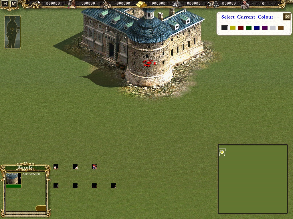
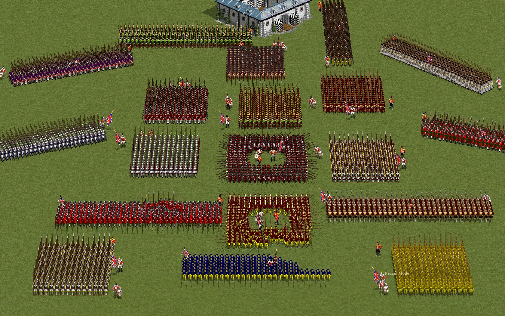
| Now you may think that I'm overthinking this, but it matters because the interface is build around icons, everything re - aligns around and with it and it goes for all nations. Having C1 graphics in game is one thing, being able to control them in a proper fashion is another. We have to get this right and it starts with the size off the icons we use.
1.) Increasing the original C1 icons ( buildings, units, upgrades) size to a larger size often results in grainy looking icons. On a large screen resolution (1650x1050,...)) it's "acceptable" but not nice, on using a low screen resolution (1024x768,...) it becomes much more visible.
2.) Decreasing size off artwork, resources ( encyclopedia gif's, in game screenshots off buildings, in game Big Icons of units and buildings from C2 by using " preserve hard edges" in photoshop results in a relatively decent result.
3.) The original C1 icons are 40x40 ( looks like 41x44 but there's black transparent border on them).
The C1 icons background goes from black (top) to shades off grey ( bottom). In game these shades off grey look ugly and sometimes even red -ish.
(See Picture 12 & 14 below) I looked in C1 but its just the same there. And again it becomes more visible on a larger screenresolution. Now that would be 'ok' if I hadnt put my C2 unit icons on a pure black background where you dont have this effect. ( Look in the icons.rar file i send you, you will see what I mean.)
The solution would be to use the encyclopedia .gif's and put them on a pure black background.
4.) You said " Honestly it will be hard to make good icons of buildings on such small scale, proably this is reason why in C1 GSC implemented only small symbols instead of pics"
"probably why GSC implemented symbols: Well, we can do that, it's just in C2 there are a lot off "new buildings", palace , fortresses, just to name a few, so we would have to make new 'symbols' anyways. And quite frankly I prefer a visible image off the building rather than a generic image. But I'm not saying no to generic symbols. It's just we havent solved the size issue then, because the C1 icons are in 40x40.
The .gif's of the buildings are around 140x140, depending on the building (height). That is more than large enough to cut decent icons from.
You have noticed that for the C2 buildings I filled up the entire icon. Maybe we should do the same, fill up the entire icon with a part of the building that is recognizable rather than getting them on a background and get as much off the building in there, which often results in very small buildings in the icon.
Silly me offcourse used the artwork from C2 ( the BigIcons (Data/Interf3/buildings...) to cut the images from. With the AC buildings ofcourse I didnt have this and put them in game and took screenshots. You can tell the difference ofcourse.
I made those C2 icons over a year ago and wasnt thinking about getting C1 units and buildings in game. If I had known , I probably would have done them differently.
Now why does size matter;)in 5.)
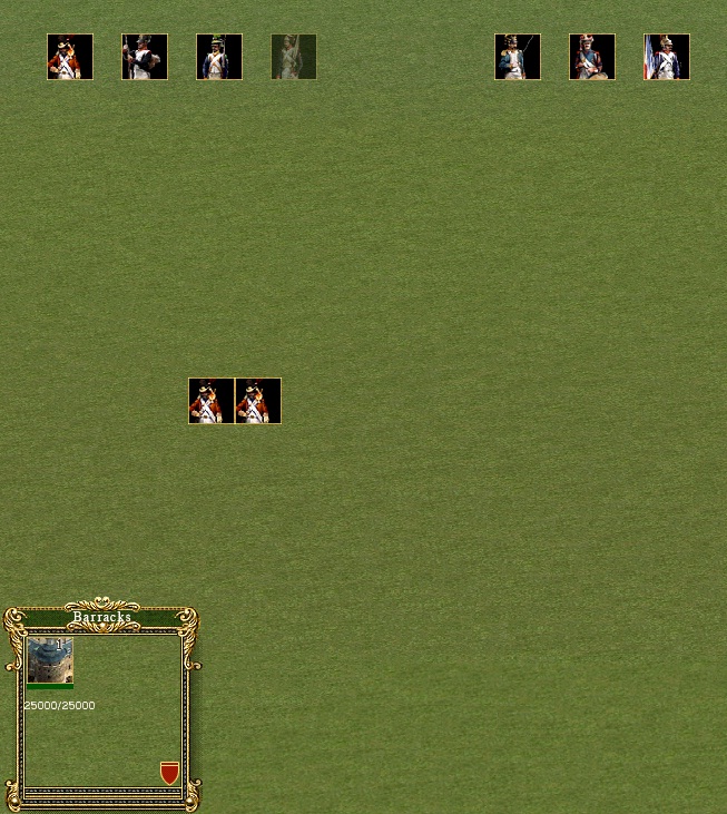
5.) Have a look again at page 2 or 3, the post I made on 28/12 at 9:00, there's an ingame image there with my original sized icons I had before I went on C1 size.(repost link to image)
There the icons in the peasant- building menu are relatively close to eachother, there's a small gap between them.
When I did icons in 40x40 (original C1 size) the gap between the icons became bigger. And in previous post (#31?) you said if it was "possible to group the icons more tight?"
Well I tried, and I havent succeeded.
The reason is, as I'v said earlier , the ingame interface consists off 15- 20 different dialogfiles that are been loaded in to ResPanel.dialogsystem.xml.
Most off these dialogfiles are "dialogdesks" ( selection point, abilities,generals, weapons, formations icons, ....) and these are quite versatile and I can pretty much control those well.
Now the problem is that for the building and peasant menu and upgrades ( the icons that come from NDS [FIXED PRODUCE]) the dialogfiles are not 'dialogdesks' but simple "GPPicture's.
On top off that, it is just 1 GpPicture with functionality on them.
Those dialogfiles are determined in the engine by name, so I cant just change it to a dialogdesk to control it better, because , and now it gets really silly, if I do that then we get twice the same in game, because the engine will still load that original system.
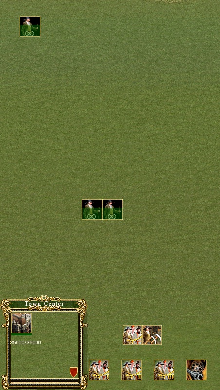
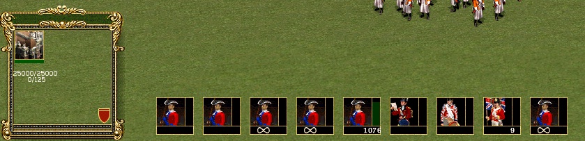
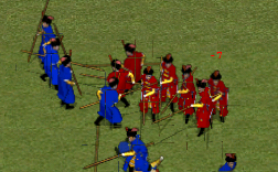
(see picture 9 and 10) Never mind where they are positioned, the icons off the units show twice and on clicking on 1 unit, it will show up everywhere as being produce
( see picture 10).
Now, since it's just one GpPicture dialog there's is nothing to move the icons tighter because I only get 1 icon. What I can do however is reposition its original position. But then the engine will still tell how far from the original icon the next one is drawn.
In this case there is 64x64 pixels space between each icon. To make this entirely clear, if in the NDS file under the [FIXED PRODUCE] a unit is declared at position 0 0 and the next unit is declared at position 0 1, then the next unit icon in game will show up 64 pixels from the first icon.
There is no limit however on the amount off rows since I can move the initial (0,0) icon anywhere.
However in width ( screensize) when someone is on a small screensize ( 1024x768) + Minimap taking up space on the right and the selection point taking up space on the left , then the amount off vertical positionsat 64 pixels per icon, is limited. If i got it right, its about 8 icons before it starts overlapping the minimap.
In height, there is no limit on the rows off icons either,again, the limit is the screensize in height, but I'm assuming we are not gonna fill up the entire screen with icons in height.
If the initial icon (0,0) is positioned at 192 pixels from the bottom, then there are 3 rows ( row 0, row 1, row 2).
If we want 4 rows in height, then I need to position the initial icon at 166 pixels from the bottom. But than the first row starts above the left selection point ( the peasant icon) and it looks ugly. If we want 4 rows in height then I need to realign the selection point higher or make it heigher.
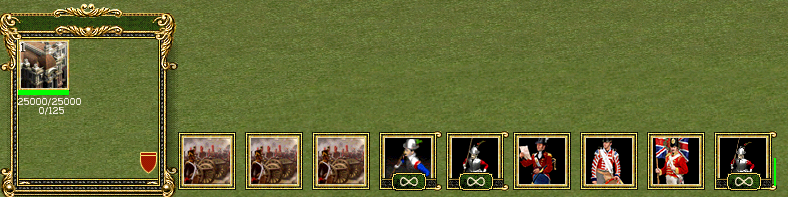
As it is now, for someone playing on the smallest resolution, its 3 rows X 8 = 24 icons. Do we need more?
Now , back to size off icons:
So in reality an icon can't be larger than 62x62 ( because there is a 1x1 pixel border from the background icon. If it was 64x64 then the icons would start overlapping eachother.
So maximum size off the icons we can do is 62x62.
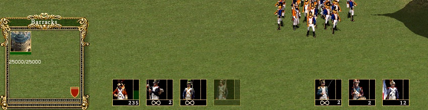
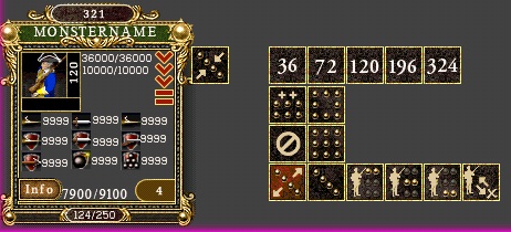
So I thought, what if we try to fill up the space between them and in the mean time use that space for the additional information that is loaded with those icons. E.g. on units, that infinite sign , amount, produce stage line.
(insert pictures 11, 12, 13,14)
Well, that fills up the space, depending on how big the background image is (now i used 54x54 with the 40x40 in it) BUT, this only really works for units, because on buildings ( in the peasant menu) there is no extra information to load. It's just an icon, when you click it you get the building under your mouse and you place it on the map. For upgrades it semi works because there is a stage bar to see progress.
The nice thing is, that issue there was with the amount off units overlapping the unit is gone, the infinite sign wasnt always clear on a white looking unit.
Details:
Original UNIT & UPGRADES sizes:
Hardcoded C2 spacing 64x64
C2 ICON BACKGROUND 56x56
(COS2 52x52)
Alex 49x49
ACFB 40x40
COS1 40x40
HOAE 37x37
SMALL ICONS ( formations, abilities,...)
COS2 34x34
ALEX 49x49
ACFB 18x18
COS1 18x18
HOAE 26x26
So, if you want the icons to be closer to eachother without as much space between them ( and I must say, with 40-42 pixel icons it is a too big gap now I think myself) ,then we need to change the size off the icons.
I'm not saying they have to be 62x62 , a small gap is "ok" but I suggest no more than 10 pixels between them , versus the 22 pixels between them now, if possible less than 10 pixels.
So if the gap is 64x64 height and width, then first off all we have to deduct a 1x1 pixel border.
Just to be clear on this, a 1x1 pixel border is height and width. That means 1 pixel on the left off the icon, 1 pixel on the right, 1 pixel on top and 1 pixel at the bottom. So a 64x64 gap minus a 1x1 pixel border leaves a square off 62 height and 62 width and NOT a 63x63.( just saying because you were doing a 55x55 to fit in the 56x56 background with a border off 1x1, that overlaps a border on the right and bottom, it should be 54x54!)
Now here are some questions I want you to think about:
1) Do we want the additional information with the unit icons ( amount, infinite sign, production stage line) on the icon or next to it?
1a) If we want it next to the icon ( below or to the right(orleft) then some pixels need to be deducted from the maximum size off 62. This is determined by the text size used for the additional information. The smallest font size I could find ingame is 10 pixels height ( either vertical positionned or horizontal)
So thats 62 - 10 = 52 - 1 (for the inner border to separate the icon and the text)= 51x51 maximum size
1b) If we want it on the icon then the size ranges between 52x52 and 62x62 pixels.
2) If we want a size between 51x51 and 62x62 ( answer 1a, 1b) then:
- For C1 units and buildings we need to cut the gifs in this size range.
- For C1 upgrades this is a problem because there are no avaible large resources for this (gifs,...). The solution would be to make the image transparent ( cut the black background) and reposition them on a larger background.
- For C1 mod units ( flagbearers, that English pike from baddog you did,...) this is a problem because there are no available resources. At best we could cut the background and reposition them in a larger frame.
- For C2 units and buildings I have already made , they can be redone because I made them based on the big graphics that are available in game.
- For (any) AC buildings new in game screenshots need to be made because there are no resources available.
A possible alternative is to have different size icons for units, for buildings, for upgrades, eg 40x40 for units, 50x50 for upgrades and 60x60 for buildings. Nevertheless, a choice has to be made.
I hope the above made sense ( if it didnt , tell me).
And two more things I want you to think about:
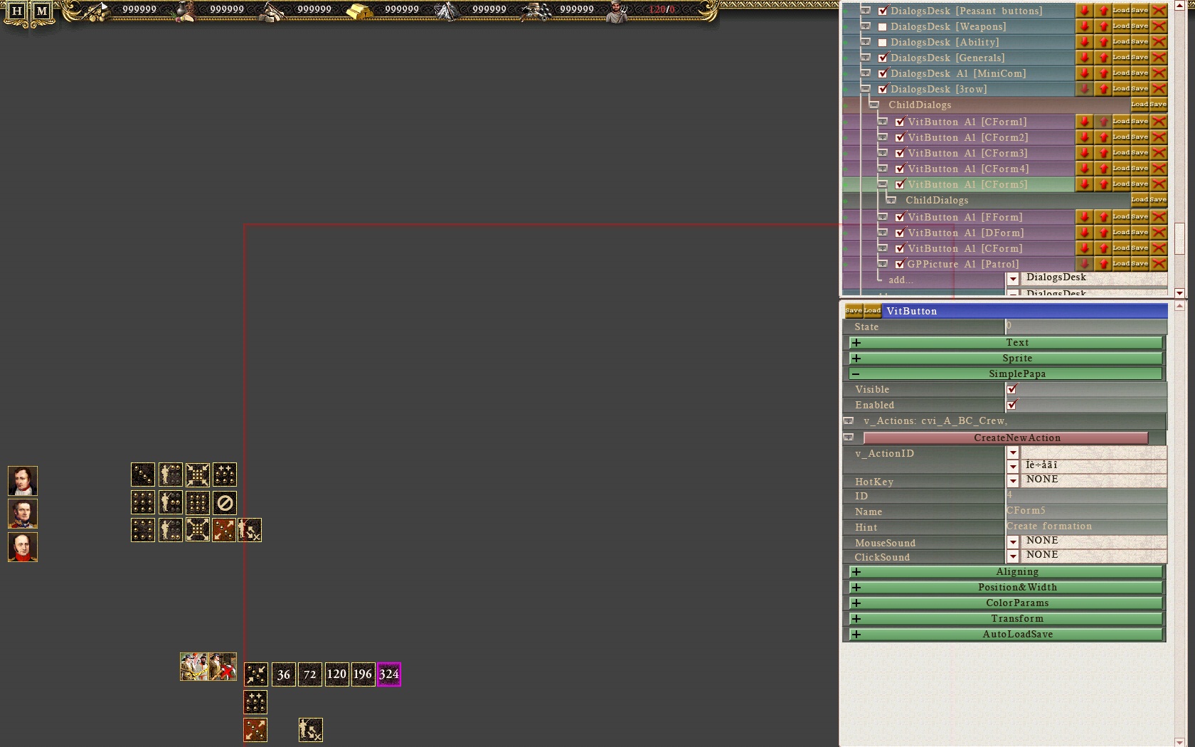
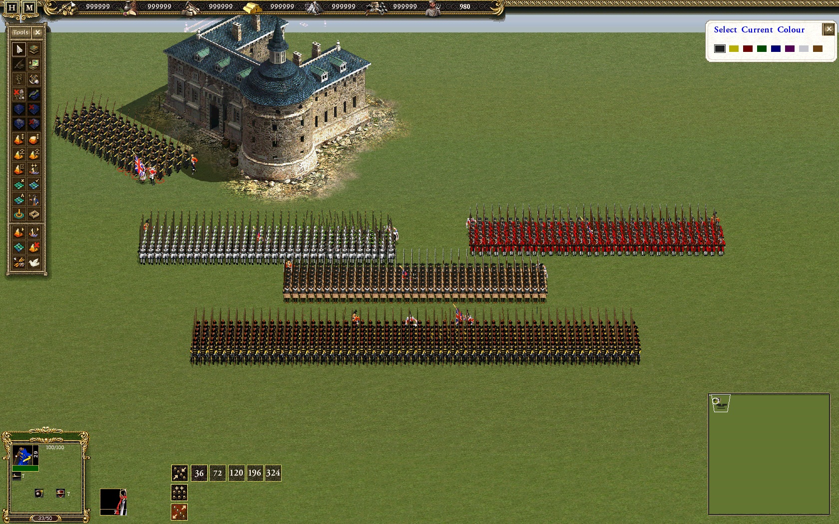
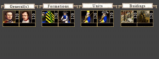
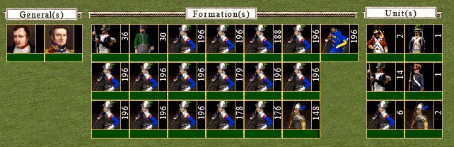
- I managed to get different formations size buttons in game,
(see picture). It works almost as in C1, but not with the + or - sign but with actual buttons, regardless off the amount the formation is.
I have 5 buttons setup up now, each different size off formations needs a button. If there are 3 different sizes declared eg 36, 72, 120 then 3 buttons will show up, if 5, then 5 will show up to choose from. However if 6 are declared , then only 5 will show up, because I only set up 5.
The question here is, how many different sizes do we need per unittype (regardless wether they are infantry or cavalry).
I was thinking about 5 ( 36- 72-120-196-324). If however you think we need 6 or more,then I need to add another button in the interface.
(insert pictures 15,16,6,5,7)
Also made some new control icons. If you can tell what they are for, then they are good. If you can't, they arent.
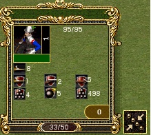
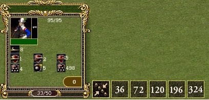
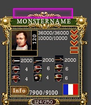
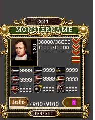
- Do you want the amount off units selected on top off the selection point or inside it?
(pictures 1, 2)
Also added some kind off frame around the multi selection point. Should change the graphics to a gold - black perhaps rather than the white.
(picture 3, 4)
So you see, something simple as iconsize has consequence everywhere.
Since you are helping, you get to make decisions aswell. If you dont choose, I will , but then we will go with whatever consequences that choice has further down the road.
EDIT:
http://www.gamefront.com/files/21152239/34+CI+BTW+GIF+ICONS.rar
Message edited by EbelAngel - Thursday, 05/January/2012, 0:24 AM |
| |
|
|
| Bzik | Date: Thursday, 05/January/2012, 0:33 AM | Message # 36 |
|
Baron
Group: Checked
Messages: 43
Status: Offline
|
Ooops I didnt notice 40x40 size, sorry:) Ill read your post today, and answer you tommorow in the afternoon, OK?
|
| |
|
|
| EbelAngel | Date: Thursday, 05/January/2012, 1:46 AM | Message # 37 |
|
Site Administrator
Group: Administrators
Messages: 996
Status: Offline
| Quote (Bzik) Ill read your post today, and answer you tommorow in the afternoon, OK?
Very well.
Also, I was wrong about the 64x64 gap.
This is a background drop off 62x62:
^^At least I was right about the 8 icons, number 9 overlaps the minimap. These are all at the lowest resolution 1024x768. Higher is no problem.
This is 64x64:
This is 66x66:
You can still see a 1 pixel gap now, so I tried to close it by using a 67x67 and this is what happened:
^^Lol , 67x67 is no good. Maximum background drop is 66x66
Then - 2 for the borders so 64x64 maximum icon size and all off the above written related to it ofcourse.
Also, the higher the size ( close the the limit off 64x64) the less the additional information ( amount, infinite sign,...) is a problem because more space becomes available on the icon itself ( referring to you saying that the amount overlapped the unit in previous images and on C1 the unit was in the middle off the icon,.... you get what I mean, right?)
Think I'v said everything I needed to tell you about this now 
EDIT: 
If you read previous posts, then you will have noticed that unit and buildings arent so much a problem, they just need to be redone, but the upgrades are
Look.
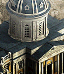
There's about 8 upgrade icons present in the original Cossacks 2 ( upgr4). These are 52x52, so putting them in a 64x64 gives a black border. Resizing them to 64x64 (upgr5) isnt too sharp, but they can be redone, because there is art work in game present and its only 8.
The problem is the C1 upgrades.
Upgr1 is 'ok' because that one has a black background. But there are also icons that dont have a black background and fill the icon.
Eg Upgr2. If you resize it to 64x64( Upgr3) it surely doesnt look sharp.
*****^"OK"***********^Hmmm**********^Ewww***********^Not too bad********^Hmmm
Here are some original sized artworks from C2 which I have used to make the majority off the C2 icons a year ago:
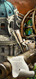
There are 2 building sizes:
First is the one that was used inside the selection point
These are 130x150:
Problem: there are no images off these for the editor buildings ( those houses for villages (french russian, austrian, ..) if you look at the icons.rar you have, you will see they are ingame screenshots.
Second building graphics are the ones used in the peasant menu.
These are 52x113:
Problem:
-there's not many off these (only 20 or so) and they are like those "c1 generic icons". Limited and you dont see which building you actually have infront off you.
-We can't reproduce this for C1 buildings
On units:
There is the one's that are used in the selection point
These are 140x240:
Problem: There are no such images for the generals ( see below)
Then there are also those that appear in the building menu
These are 52x113:
Problem:
- We cant reproduce this for C1 units
Generals:
(almost done)
So we got C2 art work for buildings with a background, but not for C2 village buildings or AC or C1 buildings.
So we probably wont them to look the same, or as much as possible.
So I just took some screenshots ( and I think GSC did this aswell and put them on a background).
I was gonna upload them here but it took forever to do one and they are .bmp's ,bit large (17MB, lol), so get them here:
http://www.gamefront.com/files/21152614/SS.rar
and open and read the comments with them below:
First one is at resolution 1024x768 (screen64.bmp)
Second is at resolution 1650x1080 (screen65.bmp)
Then I realized I can also draw them on a black background inside the fire and smoke editor. I can delete the red fire dots so you dont see them.
A black background works very easy in photoshop because it can be cut out easy, or it could be kept and then the buildings, if any background is present would like the units with a black background.
(screen67.bmp)
Ofcourse I can do this for all buildings ( AC, C1)
(screen68.bmp)
And then I also remember we can toy around with color settings ingame.
(screen 71 -screen77).
I get the best result if I set sun, atmosphere, lightdiffuse color settings to 0.
The coloured one's was a bit off fun, it shows like that on hoovering with the mouse over the building with "friendshighlighting"settings coloured.
From there its easy enough to cut the .bmp's in photoshop, size them and save as 32 bits .tga.
This is cut from screen 65.bmp
And this from screen 67.bmp
You hardly see the difference with the original one i posted above:
Same procedure used for the Austrian Barracks ( from an ingame screenshot in the building align editor- black background):
Î know see that on the originals they had light diffuse settings on. Since I disabled it, i think it looks slightly better.
I prefer the black background, though that one is more work cause I need to disable the fire points.
If you think in game shots are better, what background (textures &detailed textures )do you want? Green grass seems a bit dull?
Then sized to 64x64 to fit a 66 frame.
Just need to know the size and the above questions in previous post I had. From there on, anything is pretty much possible I suppose.
Now I'm done for today
|
| |
|
|
| Bzik | Date: Thursday, 05/January/2012, 8:07 PM | Message # 38 |
|
Baron
Group: Checked
Messages: 43
Status: Offline
| Hello!
C1PIKE.rar - try again, I downloaded it and extracted without bugs. If there will be some problems, I will reupload again.
Quote The question here is, how many different sizes do we need per unittype
If I understand you correct, we can add later different numbers of units in formation (cavalry for example 45,90... pikes 36,72... etc)? I wanted to check later some historical aspects of different nations, maybe C1 makers missed something that we can udd to spice up gameplay without spoiling fun or balance matters. So if its not problem, can you add specific numbers on buttons later? After I check some historic sources? Who knows maybe we can come into something tasty...
But if we use C2 system of shooting with 3 rows, musketeers shold be formed into gropus of 30,60,120,240,480 units. So 5 types is enough I think.
Quote Also made some new control icons. If you can tell what they are for, then they are good. If you can't, they arent.
Heh, if I see buttons outside of game, I dont even remember functions of the old ones:) Choosing right buttons ingame is automatic, did you noticed that? You have to learn every new ones, its matter of one game to get familiar with them. We only need to add proper descriptions in "ballon help" showed while hovering over selected icon.
As for graphic, these are absolutely OK, the most important fact is how many C1 or AC orders we can implement in C2.
Quote Do you want the amount off units selected on top off the selection point or inside it?
The only difference I see on screens 1 and 2 are lack of "321" and french flag in right bottom of first pic. Anyway number over MONSTERNAME looks OK.
Quote Also added some kind off frame around the multi selection point. Should change the graphics to a gold - black perhaps rather than the white.
Yes, I think that all additional graphics elements should be in one style. In this case black-gold "selection menu" style. Also I really like those gold ornaments. If you can, add them to those "formations", "buildings" menu, maybe it will nicely fit to lower menus.
Now the icons case.
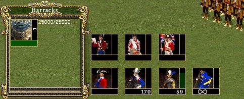
Building ICON - the bigger the better:) Austrian barracks looks great. Leave it that way.
Units - original C1 icons have more realistic look than encyclopedia gifs, but yes, not to much pretty background. I was a bit worry about this background in game, so if you tested and it looks bad, we need to change it. The gifs icons with black background looks also good, we need only to decide of cutting patern.
I ask first - have you tried to do something similiar to this (64x64, progress bar and number inside icon like in C1)?

Today I will look at upg icons also.
PS. I see you added C1 defence/attack small icons. What do you think, IMO they look very good, far better than AC.
|
| |
|
|
| EbelAngel | Date: Thursday, 05/January/2012, 8:51 PM | Message # 39 |
|
Site Administrator
Group: Administrators
Messages: 996
Status: Offline
| Quote (Bzik) C1PIKE.rar - try again, I downloaded it and extracted without bugs. If there will be some problems, I will reupload again.
Yes I think it was an error on my end. I managed to download it earlier today.
Already tried them out in game. Very nice work.
Quote (Bzik) If I understand you correct, we can add later different numbers of units in formation (cavalry for example 45,90... pikes 36,72... etc)?
Yes, doesnt matter how much unit are in a formation, i just need to know the total amount off different sizes per unit.
Quote (Bzik) So if its not problem, can you add specific numbers on buttons later?
Those numbers you see in the editor(dialogs editor) are just to show the text. I can write 10000 there, the real number off the formation is determined in the NDS, ord_groups.lst and orders.lst file.
It will load whatever is determined there.
Quote (Bzik) So 5 types is enough I think.
Allright then. That's all I needed to know for now.
Quote (Bzik) The only difference I see on screens 1 and 2 are lack of "321" and french flag in right bottom of first pic. Anyway number over MONSTERNAME looks OK.
Never mind the flag. I think I disabled it and put the number off kills a unit - formation has there, because I figured a flag off the nation is somewhat unnessary, you know what nation you play with.
But if you want the flag back, ill put it back.
The lack off the 321 ( generic number) is because only 1 unit is selected or it was a screenshot from an earlier stage. If one unit is selected no button will show. But as soon as 2 or more are selected that button on top will show up and display the amount.
It was in an attempt to "fix" the amount overlapping the uniticon, but if we use bigger icons, it is no longer a problem.
Quote (Bzik) Building ICON - the bigger the better:) Austrian barracks looks great. Leave it that way.
OK, then I can do C2 and AC building icons already but I need to wait untill we got the C1 buildings in there to make those. But I can setup the interface at least for it. 64x64 is the icon size then and66x66 is the frame backgroundsize.
Quote (Bzik) Units - original C1 icons have more realistic look than encyclopedia gifs, but yes, not to much pretty background. I was a bit worry about this background in game, so if you tested and it looks bad, we need to change it. The gifs icons with black background looks also good, we need only to decide of cutting patern.
Allright, same size then 64x64 in a 66x66 background frame.
As to the cut pattern, perhaps, position the unit like you did in your picture above, with some black background on top off the unit (lets say 10 pixels from top to the hat off the unit?), left corner for amount of units, and right corner for the infinite sign?
And perhaps the progress bar stageline at the bottom from left to right?
Quote (Bzik) I ask first - have you tried to do something similiar to this (64x64, progress bar and number inside icon like in C1)?
No I havent, because I was waiting for you to give your opinion.
Quote (Bzik) Today I will look at upg icons also.
I think we will have to redo those all and just try to make the best off it. I have a lot off resources already for these in transparent .psd format, but I suggest we start with Units and Buildings first.
Nevertheless it should not be ignored but we will probably need to make some later anyway when NDS Upgrade section is set up ( because off icon levels if you remember).
Quote (Bzik) PS. I see you added C1 defence/attack small icons. What do you think, IMO they look very good, far better than AC.
Myes, but lol, i didnt want to say anything about these in last post but they are a real pain in the a**.
In C1 these are all in one file (smicons.gp I believe).
For C2 it needs to be split up in 2 files ( I had to look in HoAE how it was done there)
Weapons_mini.g17
and
Weapons_mini_def.g17 (defense)
When I implemented them in game I got mixed results. The amount off protection (the value) didnt correspond with the corresponding icon.
I started tracing why and it seems both determined by the order off the weapons defined in the MD file under the PROTECTION string, the order off the icons in the .G17.
Then half started displaying right when I declared those in the order I suspected they needed to be.
But I got weird values on formations for e.g KARTECH ( grapeshot). It either displayed a value like 3243274 ( unreal)(i think this comes from formation bonus values declared in formation files ord_groups.lst (or orders.lst) but I need to check) or on single units something like 398 even if i set it to say 55. Like I always thought the regular 17 pike had no kartech protection only roundshiers had but in the C1 MD file they have been declared under the PROTECTION string.
The shot protection value didnt show up and was shown as a grapeshot icon with an unknown value.
The pike, sword , arrow and cannon ball protection displayed properly if i reset them.
I'm gonna have to check again, but I got a feeling that NRES.DAT WEAPONSHIELD strings have something to say in this aswell ( the order or icon value's). In any case more research on this one is needed.
In short, it's half working for defense icons, but the attack icons seem to work right.
What I want to know from you :
PC specifications:
- Operating System: XP?
- Processor
- RAM
- VideoCard RAM
- Native ScreenResolution you use to play C2
- Cossacks Napoleonic Wars version ( is it 1.0, is it 1.1 or have you installed patch 1.2?)
- Language off your C2( is it Polish?)
I want to know because I will start packing up files gradually for you (pikes implemented in game, various other files that are semi ready).
We want to work on the same version from now on.
Everytime you give me files I will implement them and add some files from my mod,rather than giving you the version i got now ( its like +-500 MB). It would be confusing and overwhelming and you wouldnt know where to start looking first.
With a gradual implemention you will understand better.
Hope that made sense.
|
| |
|
|
| Bzik | Date: Thursday, 05/January/2012, 10:42 PM | Message # 40 |
|
Baron
Group: Checked
Messages: 43
Status: Offline
| Quote As to the cut pattern, perhaps, position the unit like you did in your picture above, with some black background on top off the unit (lets say 10 pixels from top to the hat off the unit?),
Ok, I can make icons of units. Is there in Corel some tool to calculate those 10 pixels? Or just make it plus or minus 10 pixels?
Quote left corner for amount of units, and right corner for the infinite sign?
And perhaps the progress bar stageline at the bottom from left to right
Exactly. I see no flaws in old C1 icon style, so why dont leave it that way? One more thing - you want to make different bar for amount and infinite sign, or paste them on icon? I thinked of pasting those numbers (and bar if possible) directly on icon graphic.
Quote I think we will have to redo those all and just try to make the best off it. I have a lot off resources already for these in transparent .psd format, but I suggest we start with Units and Buildings first.
Ok, so I'll back to converting units.
Quote In short, it's half working for defense icons, but the attack icons seem to work right.
I'll keep fingers crossed night and day 
My laptop:
XP SP3
AMD ATHLON 64 X2 D-C TK-57 1.89 GHz
1,87 GB RAM
nVIDIA GeForce 7000M
Screen 1280x800? on laptop, with monitor 1280x1024
Few days ago I bought on polish ebay C2:NW. Seller said that those game have "unused internet code", so its possible to go online. I didnt look at registration so far. Version in menu: 1.2 [B9DB], polish language.
Its no hurry, keep files until mod version will be stable for testing. At this moment I can take care of peasant work like converting (dont forget to add to my menu some converting upgrade so I wil work 30% faster).
Seeya!
|
| |
|
|